Virtual staging lives or dies on one thing: whether the room feels real. And let me give you some behind-the-scenes info: the “real” is usually in how the lighting is done. Buyers won't comment on the shadows not matching the light sources, trust me, they'll notice it. And that'll make them feel that the whole listing is off.
This guide is for agents who already get virtual staging but they want to be better at judging if it's any good. We’ll cover:
- the lighting mistakes that instantly give away staged photos
- how to prep photos so staging looks believable
- how to make rooms look brighter without making them look fake
- when AI staging struggles most (and how to avoid it)
- a simple checklist you can use before publishing
Why Lighting Matters More Than Furniture in Virtual Staging
The brain is weirdly sensitive to lighting inconsistencies. If a couch is slightly too modern, buyers don’t care. If the light is coming from the left in the real photo, but the staged lamp shadow falls to the right… the image stops feeling like a photo and starts feeling like a render. The whole listing starts feeling a filthy lie you concorted to trick them.
Lighting controls three things buyers care about:
- Space (bright rooms feel bigger)
- Cleanliness (dark photos feel dingy)
- Trust (inconsistent lighting screams “edited”)
This is why the goal of any virtual staging project should never be "perfect lighting." It should be believable lighting. If you're working with a virtual staging company, make this explicit in your order notes. Some providers prioritize speed over realism, and lighting is usually the first thing that suffers.
The 3 Kinds of Light in Virtual Staging
Most listing photos include some mix of:
1) Natural light (windows) - This is the dominant light source in most shots. It sets the direction of shadows and overall warmth. t's the single most important element your virtual staging needs to respect.
2) Ambient room light (ceiling fixtures) - This affects the overall brightness and color temperature. Often warm, sometimes mixed with daylight (which is where things get messy). It's often warm-toned, and when it mixes with cooler daylight from windows, it creates the kind of uneven color temperature that makes virtual staging especially difficult.
3) Bounce light (reflections from walls/floors) - This is subtle, but it’s why white walls make rooms feel bright. It also disproportionately affects how “real” a staged object looks in the space. Bounce light is why white walls make rooms feel bright - light reflects off surfaces and fills in shadows naturally. When virtual staging ignores bounce light, furniture looks pasted in rather than placed in the room.
Professional virtual staging must account for all three. Miss any one of them, and the result looks like a collage rather than a photograph.
Virtual staging has to match all three. If it doesn’t get them right, the furniture feels pasted in.
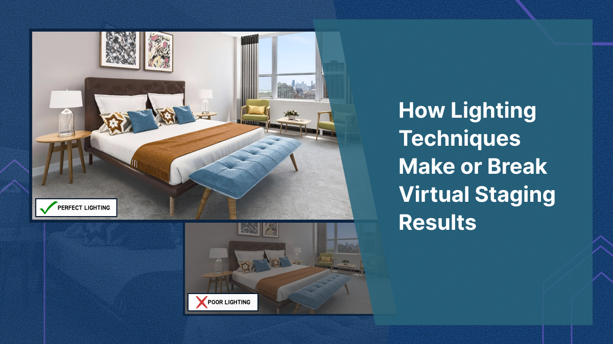
The Lighting Mistakes that Instantly Make Staging Look Fake (And Yuck)
These are the ones that ruin otherwise good staging.
1) Shadows that don’t match the window direction
If window light is clearly coming from the right, staged shadows must follow that. If you want to spot bad staging look for:
- the sofa shadow doesn’t match the table shadow
- the rug looks flat with no grounding shadow
- a lamp casts a shadow that ignores the window light completely
Professional staging teams manually match shadows. Bad stagers, (and often AI tools) try to approximate them, and make the whole thing look rendered in bad CGI.
2) Furniture looks “too bright” for the room
This happens when a room has naturally dim or moderate lighting, but the virtually staged furniture looks like it was photographed separately in a brightly lit studio. The furniture pops out from the scene in a way that immediately reads as artificial.
The fix isn't simply "make the furniture darker." The real solution is to match the contrast and exposure of the staged elements to the existing room conditions. Bright furniture in a bright room looks natural. Bright furniture in a dim room looks like a bad Photoshop job.
This is one of the hardest things to get right in virtual staging, and it's a skill that separates experienced designers from beginners. Having trained dozens of virtual staging designers, I can tell you it takes significant practice to develop an eye for exposure matching.
3) Mixed lighting that makes colors look wrong
Many listing photos have a combination of warm interior lights and cool daylight streaming through windows. This mixed lighting creates uneven color temperature across the room — and it's one of the trickiest scenarios for virtual staging to handle well.
You'll spot this problem when:
- Walls look warm-toned, but staged furniture appears cool or grey
- White surfaces look slightly blue in one area and w in another
- The furniture tone clashes with the room's existing warmth, as if it belongs in a completely different space
- Staged metallic accents (lamp bases, table legs) reflect a color temperature that doesn't exist in the room
Color temperature mismatches are subtle, but they create a subconscious sense that something is wrong — exactly the feeling you want to avoid when buyers are evaluating your listing photos.
A lot of listings have:
- warm interior lights
- cool daylight from windows
That mix is a nightmare for staging because it creates uneven color temperature.
You’ll see this when:
- walls look warm, but staged furniture looks cool
- whites look slightly blue in one area and yellow in another
- the furniture tone clashes with the room’s existing warmth
4) Over-edited HDR photos
HDR photography can make rooms look impressively bright and detailed, but aggressive HDR processing often kills the realism that virtual staging depends on.
When HDR is pushed too far, you'll notice a distinctive look: edges glow unnaturally, highlights are completely blown out, and shadows appear artificially flattened. The result is a base photo that has no clear light direction - and without clear light direction, virtual staging has nothing to anchor to.
Shadows on staged furniture end up looking "invented" because there's no consistent light source to reference. The entire image takes on an uncanny, hyper-processed quality that makes even excellent virtual staging look synthetic.
What Agents Should Do Before Virtual Staging Begins
Most agents think of virtual staging as something that happens after the photos are taken. But the quality of your staging is largely determined by the quality of your base photos. Investing a few extra minutes during the shoot pays enormous dividends in staging realism.
Here’s what helps the most.
1) Shoot for consistency
High-contrast, "artsy" real estate photos can look striking on their own, but they're significantly harder to stage convincingly. The best base photos for virtual staging are:
- Evenly exposed across the frame - no extreme bright spots or dark corners
- Bright but not blown out - detail preserved in both highlights and shadows
- Geometrically corrected - straight vertical lines, no visible lens tilt
- Minimal color cast - neutral white balance that doesn't skew warm or cool
Tell your photographer you're planning to use virtual staging. Good photographers will adjust their approach accordingly.
2) Turn off lights if daylight is strong
If a room has strong natural daylight, leaving interior lights on often creates conspicuous warm yellow patches in the photo. Those patches create a color temperature conflict that makes virtually staged furniture look mismatched no matter how carefully it's done.
When daylight is your primary light source, let it do the work. Turn off lamps and overhead fixtures to create a cleaner, more consistent base for virtual staging.
3) Avoid ultra-wide distortion
Ultra-wide lenses make rooms look bigger, which is why they're popular in real estate photography. But they also warp edges and distort proportions — and staging furniture into a warped room creates scale problems fast.
A chair might look the right size in the center of the frame but appear stretched or compressed near the edges. These distortions are subtle individually, but they add up to a virtual staging result that feels "off" without the buyer being able to articulate why.
4) Clean window exposures (don’t blow out everything)
Overexposed windows create a flat, directionless light source. When windows are blown out to pure white, there's no visual information about where the light is coming from or how strong it is. Virtual staging designers are then forced to guess at shadow placement, and guessed shadows rarely look convincing.
Ask your photographer to preserve some detail in window areas, even if it means the room interior is slightly less bright. That trade-off produces far better virtual staging results.
How to “Brighten” a Staged Room Without Making It Look Fake
Most agents want brighter photos. Buyers respond to bright. But bright can easily become fake.
Here’s the way to do it.
Use brighter surfaces, not brighter everything
Instead of raising the overall exposure of the image (which flattens the lighting and reduces realism), use virtual staging choices that naturally brighten the room:
- Light-colored area rugs that reflect ambient light
- Cream or white sofas used in moderation
- Light wood coffee tables and side tables
- Mirrors or bright wall art that create the impression of reflected light
- Fewer dark accent pieces competing for visual attention
This approach makes the room feel brighter through the staging itself, without altering the photo's underlying lighting reality. The result is a virtually staged room that looks inviting and spacious while still feeling photographically authentic.
Add contrast carefully
The room needs some contrast to feel crisp. But too much contrast makes staged objects look cut-out. A useful rule of thumb: bright rooms benefit from soft, gentle contrast in the staging. Dim rooms need staging that matches the existing contrast level rather than fighting against it. Trying to force brightness into a naturally dark room through high-contrast staging almost always looks worse than working with the room's actual lighting conditions.
- Bright room = soft contrast
- Dim room = match contrast, don’t fight it
Lighting and Style: What Works Best in Listing Photos
Not every staging style works in every lighting situation. Here are the combinations that consistently produce the most convincing. and most appealing, results in listing photos.
Bright, airy lighting + modern neutrals
- warm white base
- soft greige
- light wood
- subtle blue/green accents
This combination works in most markets and photographs well under natural daylight. It reads as clean, contemporary, and move-in ready — which is exactly what the majority of buyers are looking for. It's the most versatile virtual staging approach and the safest default choice.
Warm lighting + cozy staging
- beige/taupe base
- warm woods
- textured throws
- minimal shiny surfaces
This works best for family homes, older inventory, and properties with warm interior lighting that would clash with cool-toned modern staging. The key is leaning into the warmth rather than fighting it.
Cool daylight + crisp minimal staging
- light grey base
- black accents
- simple décor
- minimal clutter
This combination works particularly well in condos, lofts, and recently renovated listings where the architecture is the star. Cool daylight plus minimal staging creates a gallery-like feel that appeals to design-conscious buyers.
Why AI staging struggles with lighting (and what to do about it)
AI-powered virtual staging tools have improved dramatically and can produce impressive results in many scenarios. But lighting remains their most consistent weakness — and understanding why helps you get better outcomes.
The core issue is that AI virtual staging tools aren't simulating actual light physics. They're generating pixels that look statistically plausible based on training data. Most of the time, this produces convincing results. But when the lighting situation is complex or unusual, AI tools often produce telltale errors:
- Shadows pointing the wrong way — the AI doesn't "know" where the windows are, so shadow direction is essentially a guess
- Reflections that don't match window placement — glossy surfaces show reflections that contradict the room's actual light sources
- Studio-lit furniture in dim rooms — the AI defaults to well-lit furniture because that's what dominates its training data, regardless of the room's actual brightness level
- Inconsistent shadow softness — some shadows are crisp while others are diffused, when the room's lighting should produce one or the other
How to reduce AI lighting issues
Start with the best possible base photo. Even exposure, clean lighting, and minimal color temperature conflicts give AI tools the best chance of producing realistic results.
Avoid mixed lighting scenarios when possible. If you can control the shooting conditions, a single dominant light source (ideally natural daylight) produces more consistent AI virtual staging results than complex multi-source lighting.
Don't accept "close enough." Most AI virtual staging tools let you regenerate results. If the shadows don't match or the lighting feels off, regenerate until they do. The difference between a "close enough" result and a properly lit one is the difference between a listing photo that builds trust and one that erodes it.
Use AI for speed, but use professional virtual staging when stakes are high. AI virtual staging is excellent for generating quick variations, testing different styles, and staging lower-stakes listings efficiently. But for hero images, luxury listings, or any situation where a single photo might make or break a buyer's interest, professional virtual staging with human designers who manually match lighting, shadows, and color temperature is worth the investment.
A simple “publish checklist” for staged photos
Use this checklist on every virtually staged photo before it goes live on a listing. It takes less than two minutes per image and catches the problems that make buyers distrust your photos.
Lighting Realism
- Do all shadows match the direction of the primary light source (usually windows)?
- Do staged objects have grounding shadows that make them look like they're sitting on the floor, not floating above it?
- Do highlights on staged furniture match the brightness level of the rest of the room?
- Are there any objects that look "studio lit" compared to the room around them?
Color Temperature
- Does the staged furniture feel too cool or too warm relative to the room?
- Are there any conspicuous yellow patches or blue color casts?
- Do whites look consistent throughout the image?
- Do metallic surfaces reflect colors that make sense given the room's lighting?
Consistency Across the Listing
- Does the same room look consistent across different angles and shots?
- Is the color palette coherent from photo to photo?
- Does the lighting mood stay consistent throughout the listing's photo set?
- Would a buyer scrolling through all photos feel like they're looking at one cohesive home?
The Believability Test
Look at the final image and ask yourself honestly: if you didn't know this was virtually staged, would you believe it was a real photograph of a furnished room?
If the answer is "probably" or "maybe" — that hesitation is a problem. Regenerate, adjust, or send it back for revision. That flicker of doubt you're feeling is exactly what buyers will feel too, and uncertain buyers don't book showings.
The Bottom Line on Lighting in Virtual Staging
Lighting is the invisible line between virtual staging that feels credible and virtual staging that feels cheap. When the lighting matches — when shadows fall correctly, brightness levels are consistent, and color temperatures align — the buyer doesn't even register that the room has been staged. They just see an attractive home and start imagining themselves in it.
When lighting doesn't match, buyers fixate on the edit instead of the space. Their attention shifts from "could I live here?" to "what are they hiding?" — and that shift is a death sentence for any listing.
Getting lighting right isn't about perfection. It's about consistency, believability, and respecting what the original photo tells you about the space. Nail those three things, and your virtual staging will do what it's supposed to do: help buyers fall in love with the home.
When lighting doesn’t match, the buyers spend a lot of their time on the edit - which is a death sentence in this business.
If you want staging where lighting, shadows, and realism are dialed in by our team of top designers, explore our virtual staging services at VirtualStaging.com.

